Monday 19 January 2015

{Adaption A} 07: Infographic - Ideas Development and Influence Maps

Previous post

Infographic: 'The Top 10 Facts about Weird Science'

After researching the uncanny and weird / creepy imagery, I have realized that focusing on making my graphic designs look this way is unnecessary because a surreal use of colour, such as via contrasting colours, would better achieve the 'weird-factor' without going too far. To focus too much on the uncanny is likely to be at the expense of the more important science / 1950s B-movie aesthetic. 

A preferred basis would be for any graphic designs to keep a cardboard cut-out aesthetic, but be simple in design. 

I have since moved on to primarily researching art of the 1950s to help guide my graphic design aesthetic, as illustrated by the Influence Map below...


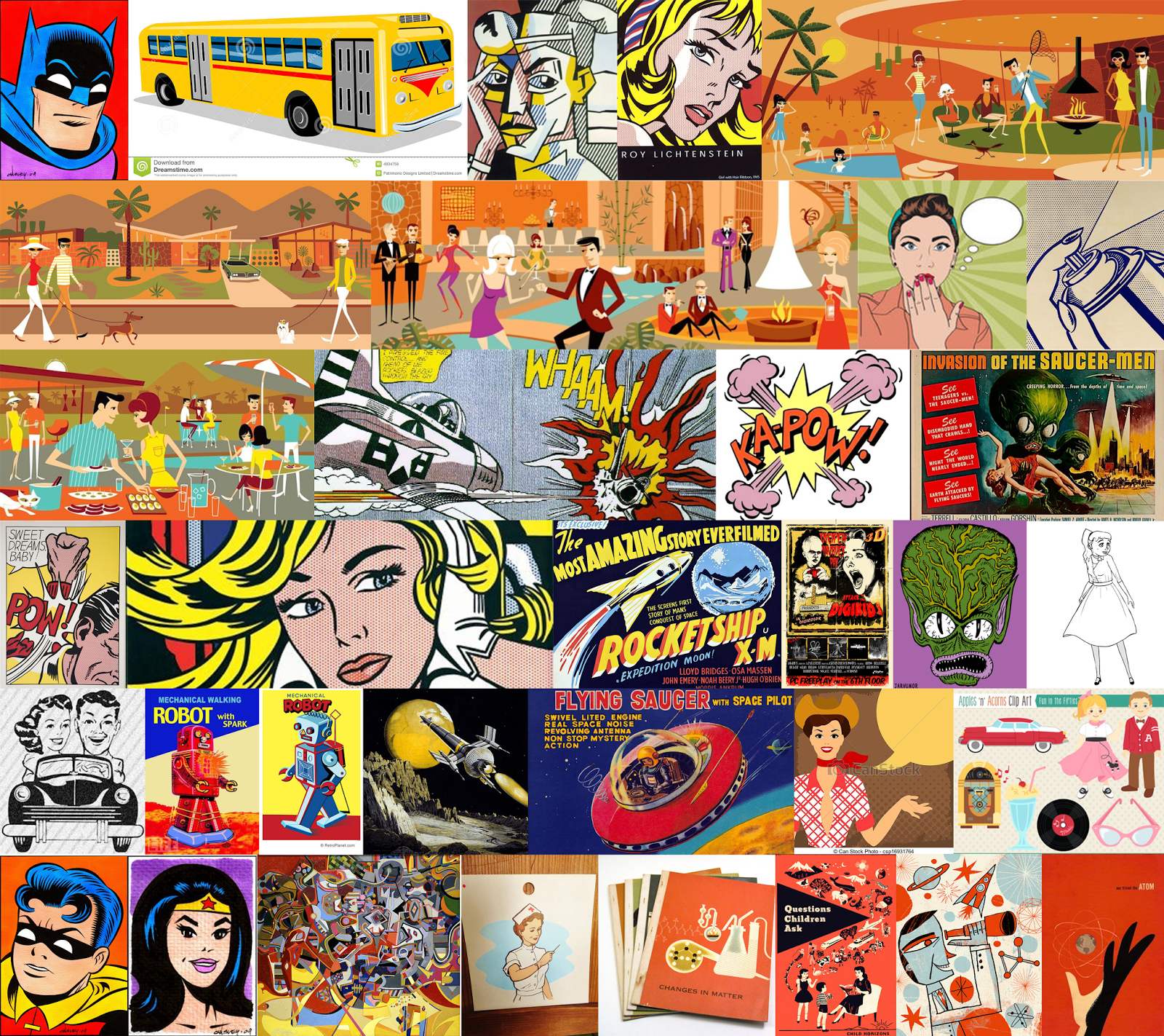
1950s Art - Influence Map 


Weird / Creepy - Influence Map

No comments:

Post a Comment