Saturday 31 October 2015

[Minor Project] 11: Water Character Thumbnails 01-14

Even though slightly too complex at the moment, thumbnails 06 and 07 are my favourites so far. 
I especially like the water drop shaped head and the incorporation of the wave shape into the lower body, and may bring these aspects forward into future thumbnails...


Friday 30 October 2015

[Minor Project] 10: Water Character Influence Map


@Phil [Minor Project] 09: Intro Storyboard Thumb. 1-10 & Branding Thoughts

Here's my Elements Academy intro storyboard so far. I have rejected thumbnails 3 & 4, meaning the sequence so far runs 1, 2, 5-10. This does not yet represent the full intro, nor are the character designs I have depicted finalised.

Intro storyboard thumbnails 1-10

The hand-drawn storyboard method above does not suit the aesthetic of my pre-established thumbnail process of using vector shapes to build the characters. Below I have experimented with alternative design options...


My particular favourite is Option 03. While it also uses vector shapes, it feels a lot more free than Op 02, and unlike Op 01 it allows for easy experimentation with colours.


Initial Branding Thoughts
In light of yesterday's lecture by Tom McDowell, aspects of my design language will receive somewhat of a reboot in order to develop Elements Academy as if it were a web series designed with its characters and objects able to be easily converted into toys as part of mock-merchandising.

A very nicely designed spaceship by Tom McDowell [source]

Floating Limbs
I might have to re-think my characters floating limbs, since if this were a real world toy, tactical placement of the limbs onto the body or a prop would be required (see Rayman), this may limit the available poses and the toy's interactivity.

Rayman figures [source]

Elements Academy Exterior
The design of the Academy's exterior needs to be massively rethought. Rather than designing it to look like a generic serious looking old-style school/academy as seen in the current storyboard, I need to pull from shapes that exist within chemistry & general science - if this were a toy it needs to be eye catching.

Walt Disney Concert Hall, Los Angeles [source]
Chemistry lab equipment [source]

Colours
Each object or character must be limited to a maximum of 4 colours each, keeping in mind that the more colours a real world toy uses, the more expensive it is to paint; as I learnt from McDowell yesterday this is due to each colour requiring an extra coating of paint for it to be achieved.

Bendy men [source]

Material
I really like the idea of my characters being textured as if they were made from vinyl. The benefit of this material is that while it still has that important toy aesthetic e.g. smoothness, glossiness, its appearance does not look too childish for an 11-13 year old target audience, such as in the case of highly glossy polypropylene (PP) toys. Active research would of course be required for me to evaluate my claim...

Earl Vinyl Figure [source]
PP plastic Dory figure [source]

Sunday 25 October 2015

[Minor Project] 08: Branding Research 01; Series Intro Sequences

Below I have looked into multiple popular TV and web series intros aimed at or enjoyed by a child and/or teenage audience, and have written about various aspects of them, including the presentation of characters, use of camera, colour and music. 

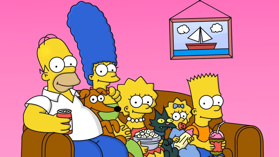
The Simpsons HD Intro with Thirds Grid

Secret Millionaires Club Intro with Thirds Grid

Glee Season 01 Intro with Thirds Grid

Fizzy's Lunch Lab Intro

Camera
Simple camera movements are used and the intros hold a strong awareness of the rule of thirds; points of interest exist within the centre of the frame wherever possible and the camera leads you directly towards them. 

Static camera shots as well as left, right and especially forwards dolly shots are a successful combination. For the animated examples, camera rotations are absent, while within the live-action Glee example, any use of camera rotation is only subtle, such as via panning.

[source]


Characters
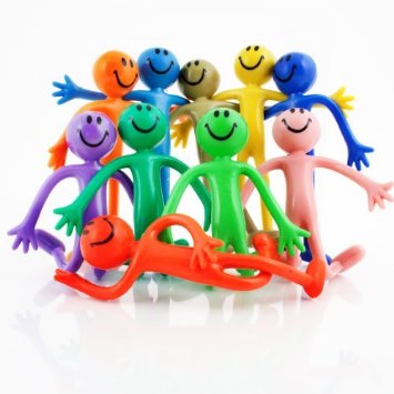
In The Simpsons (TS), Secret Millionaires Club (SMC) and Glee intros, establishing the characters personalities is clearly an important factor. This is achieved through their physical activities, emotions or a snapshot of their everyday lives. The muscle character's personality of Fizzy's Lunch Lab (FLL) is also well presented via his pose and expression.

[source]


Colour
Regarding the animated examples colour saturation and brightness primarily ranges between mid to high, giving a happy, positive vibe to the animation while also making it eye catching; yellows, greens and blues are much used examples, while purples and red are less used. In the case of FLL where the red & white plaid background is deliberately reminiscent of a tablecloth.

[source]


Episode Title
Whilst visually The Simpsons differentiate their episodes via their various couch gags, SMC and FLL both show the title of the episode. SMC shows the title name over an exterior shot, while FLL presents their episode name in an interesting and appealing way alongside a muscle character relevant to the episode; a way of presentation I find appealing.

Due to the shorter nature of web series when compared those on television it would be necessary for the intro sequence of my Elements Academy web series to be short, perhaps around 10-15 seconds long for a 4 minute episode, allowing enough time for the episode to play out without feeling rushed.

[source]


Locations
The intro sequences introduce the audience to some of the locations they'll see during the series, with shows focusing on a single location the intro can involve an exterior shot, such as in FLL or a corridor shot as shown in the Glee intro.


Logo
In most cases the logos are presented to the audience in an interesting way, and are designed in a way that grabs the audience's attention, either by the way it enters, such as constructed by machinery in FLL, or moving toward the camera in The Simpsons intro, or via its design, colours scheme or a combination of all three. A great example of this is the use of complementary colours yellow & blue for The Simpsons logo. Each logo remains on screen for around 4-5 seconds.

[source]


Music
Whilst not directly presented here, a very useful even very important aspect of a successful series intro is a catchy and interesting theme tune. For a child to young teenage target audience having a theme tune with catchy vocals can sometimes be even more useful for drawing the viewer's attention, however this does depend on the energy and mood of the series itself, but this can also be achieved via interesting visual stimuli.

Wednesday 21 October 2015

[Maya Class] Character Poses 01

Alan assigned us the task of creating 5 character poses before our next Maya class; the original character I was using became corrupted this evening, so tonight I have started again with a new character rig from creativecrash.com [here], here is my progress so far...

Freddy Krueger style character posing

Saturday Night Fever style character posing

My most successful pose so far is without a doubt the Freddy Krueger pose.

Monday 19 October 2015

[Minor Project] 07: Iron Character Thumbnails 109-144; Front Silhouettes 01

The main struggle with this stage of the design process was achieving a hand design that did not look too organic, yet still suitable as Iron's hands; from thumbnail 134 onwards the claw from 'grabber' machines became an important hand influence. For clarity the head shape has been outlined within the silhouettes. My favourite thumbnails are 141 and 143.

Iron Thumbnails 109-144

New Influences

Tuesday 13 October 2015

[Minor Project] 06: Iron Character Thumbnails 94-108; Profile Silhouettes 03

Phil recommended converting Iron's legs to either short wind up toy-like legs, or replacing them entirely with caterpillar tracks, or something of that appearance; my favourite thumbnails are 100 and 103.

Iron Thumbnails 94-108

New Iron Influences: Caterpillar Tracks

Saturday 10 October 2015

[Minor Project] 05: Iron Character Thumbnails 86-93; Profile Silhouettes 02

I plan to take forward thumbnail 91, however I would happily take forward 92 instead, as long as the smaller head, longer legs & thinner torso do not remove from the strength aspect of Iron's design.

Iron thumbnails 86-93

Friday 9 October 2015

[Minor Project] 04: Iron Character Thumbnails 75-85; Profile Silhouettes

After Phil's feedback on my previous post, I have revised my approach to Iron's silhouettes and have designed this batch in a profile view and reduced the complexity of my geometry to better suit my previously created characters. 
My favourites are 80 and 85.

Iron thumbnails 75-85

Expanded Iron influence map

Saturday 3 October 2015

[Minor Project] 02: Iron Character Thumbnails 01-39 and Influence Map

Thumbnails
01-18 focus on the head, my preferences are 15 & 18. 
19-22 focus on the head & chest, with my preference being 22.
23-39 focus on development of the hand, of which I prefer 37 & 39.
Next up I will be designing the feet silhouette, then bringing it all together before entering the detailing stage...


Influence Map

Iron Information
Name: Iron. Symbol: Fe. Colour: lustrous, metallic, greyish tinge. Melting point: 1538°C. Boiling point: 2861°C. Crystal structure: body-centred cubic (solid state)

Iron is a pyrophoric material; in the presence of oxygen, iron catches on fire automatically. Pyrophorics are substances that spontaneously ignite below room temperature, which is about 21°C. 

Iron immediately develops a thin coating of iron oxide (rust) upon contact with oxygen in the air, sealing off the iron inside from exposure to the air and reduces the rate of further rusting. This is why iron doesn’t burn someone holding it. Rusting is an exothermic reaction called oxidation; Iron + Oxygen = Rust + Heat. [source]

Iron is relatively abundant throughout the universe. Iron nuclei are very stable. Pure iron is very reactive chemically and rapidly corrodes, especially in moist air or at elevated temperatures. The word iron is possibly derived from earlier words meaning “holy metal” because it was used to make the swords used in the Crusades. Iron was known in prehistoric times and smelted iron artefacts have been identified from around 3000 BC.

Iron compounds are essential to all life e.g. iron is the key component of haemoglobin, it is an iron atom that is responsible for carrying oxygen around the blood stream. The core of the earth is composed largely of iron. Iron is found native in meteorites known as siderites. [source]