Showing posts with label Influence Map. Show all posts

Monday, 18 April 2016

[Major Project] 43: Various Chemistry Equipment; Orthographic Projections

These were all created with my Hydrogen & Oxygen characters hands in mind, particularly Oxygen's humanoid hands. Once modelled and UV mapped, the relevant equipment will be duplicated and scaled up within Maya to suit Iron's massive hands. The red & blue colour scheme is only for clarity and does not represent that of the final 3D modelled objects. Not included in the orthographics are a plug socket, water tap and a sink.


Using a combination of Maya's measure tools (in centimetres), and a Photoshop canvas in which 1000 pixels represents 1m, 10px = 1cm, and 5px = 5mm, I was able to more easily figure out dimensions that would work with the characters.


Measuring the character...

Figuring out pixel dimensions...

Creating a correctly-sized shape...

I have also provided an expanded Classroom Influence Map, which now includes the images that helped me figure out the equipment's scale relative to each other & their basic shape.


Friday, 1 April 2016

@Phil [Major Project] 33: Classroom 01; Floor Plans 01-21 & Influence Map

The floor plan thumbnails only represent the position of objects, rather than their exact shapes. They do not include chairs or equipment such as bunsen burners, flasks etc. In most of the thumbnails the entrance's location is not indicated. My favourites are 21, 10 and 19. The widely known Bohr-Rutherford diagram of an atom was heavily influential on the layout of the majority of my thumbnails.

Classroom Floor Plan Thumbnails 01-21

Classroom Influence Map

Bohr-Rutherford diagram of a Calcium atom [source]

Saturday, 9 January 2016

@Phil [Minor Project] 45: Water Character; Shoelace Tests & Favourite Design

In response to Phil's feedback on my previous post I have tested out shoelaces to more clearly connect Water's feet to trainers. At first I was torn between 94 and 98, however I realised that whilst 94 was more simple, this simplicity may lead to the X shape being confused as just being a pattern rather than representing the laces, which 98's laces present as much more clearly. As a result, 98 is my favourite thumbnail.

Favourite

Water character thumbnails 83-98

Shoelaces Influence Map

Saturday, 2 January 2016

@Phil [Minor Project] 40: Water Character; Colour Tests 01-05

Because I was already dealing with blue during Oxygen's colour testing, I have decided to begin my Water colour testing by picking from some of his colour tests. As usual I will also do some colour picking using my Water character's Influence Map, but for now CL02 is my favourite.

Favourite Water colour test & Oxygen comparison (not to scale)


Oxygen's colour tests

Water's Influence Map

Wednesday, 23 December 2015

[Minor Project] 36: Water Character; Revised Influence Map & Character Info

During a previous tutorial with Phil, we discussed various aspects of Water's personality. Water will be female, she'll also be best friends with Oxygen in the sense of a Jack & Jill, Harry & Hermione, or head boy & head girl kind of relationship. Hydrogen may have a crush on Water, making him jealous of Oxygen's friendship with her. This jealousy would be the reason behind the argument between Oxygen and Hydrogen in episode one of Elements Academy.


Like Oxygen, Water will be a popular character because in reality water brings life; children also grow up with water and oxygen being a good thing. As well as popular, Water will be powerful, confident and courageous, whilst also energetic and sporty. She is not a "girly girl", nor drippy. Phil suggests that Water and Oxygen would be the characters that re-occur the most within the Elements Academy series.

Wednesday, 9 December 2015

[Minor Project] 28: Oxygen Character; Colour Tests 01-10

Taking Oxygen thumbnail 75 ahead, I have performed multiple colour tests. Feedback from Kayliegh indicated that her favourites are CL08 and CL02, meanwhile my favourites are CL09CL03 and CL02
Next up is designing Oxygen's hands...


Favourites

Oxygen Colour Tests 01-10

Colour Influences with Swatches

Friday, 4 December 2015

@Phil [Minor Project] 26: Oxygen Character; Thumbnails 56-75

After receiving feedback from Phil and Jackie about my previous Oxygen thumbnails, I have adjusted my tactic. The main changes include the moving of the facial features higher up the body, the addition of a button nose, and bringing back the mouth's horizontal symmetry. My favourite thumbnails are 75, 70 and 68

In thumbnail 75, to help fill the blank space on Oxygen's body I tested out a tie inspired by the Erlenmeyer flask, however it quickly became apparent that this wasn't really working and I removed it in the next thumbnail.

Favourites

Oxygen character thumbnails 56-75

More influences

Saturday, 28 November 2015

@Phil [Minor Project] 25: Oxygen Character; Thumbnails 26-55

In response to Phil's feedback on my previous post I have adjusted my approach to Oxygen's design. My favourite thumbnails are 55, 49 and 43I quite like 49, however I'm unsure whether the off-centre mouth adds too much asymmetry to the design? This is why it has been shown as my second favourite, rather than my first.

Favourites

Oxygen character thumbnails 26-55

New influences

Thursday, 26 November 2015

@Phil [Minor Project] 24: Oxygen Character; Thumbnails 01-25

There are similarities between the design of Oxygen and Hydrogen because it is important for the audience to believe that these two characters could combine to create the Water character. The large mouth and 'quiff' are important aspects of Oxygen's design, with the former connecting to breathing and the latter to Oxygen's kindly yet mischievous nature. The hands have not been designed yet, but I partly know how they're going to look. The grayscale is not representative of Oxygen's final colour scheme. My favourite thumbnails are 24, 14, 20 and 09.

Favourites

Oxygen character thumbnails 01-25

Oxygen character Influence Map 01

Hydrogen character front view

Monday, 16 November 2015

[Minor Project] 21: Iron Character; Front View Colour Tests 01-04

At the moment I have taken my four favourite colours from my previous tests and applied them to Iron's front view. Iron's hands still require being redrawn palms down, but for now that is not the focus of the attention. So far my favourite is CL03, I like how the darker desaturated blue works with the grumpiness of Iron, whilst not being so dark as to fall into the colour realm of my Graphite character.


Iron Colour Tests 01-04

Graphite Front & Side Orthographics 

[Minor Project] 20: Iron Character; Colour Picking & Top 4


All Colour Swatches

Sunday, 15 November 2015

[Minor Project] 19: Iron Character; Face Thumbnails 21-40

In response to my previous post, Phil advised me to bring my Graphite (Carbon) character back into the mix, to ensure Iron is distinct. He suggested presenting their faces together so they could be nuanced accordingly. 
My favourite thumbnails are 39, 40 and 22.

Favourites

Iron (09) & Graphite Head Comparison 

Iron Face Thumbnails 21-40

Thursday, 12 November 2015

@Phil [Minor Project] 18: Iron Character; Face Thumbnails 01-20

The grayscale represents Iron's colour brightness only, not the final hue or saturation. Iron's brows have been coloured more lightly for clarity, however as part of the character model these would be the same colour as Iron's body to keep with the 4 colour limit intended for each character (sclera/eye-whites, pupils, body, mouth). 
My favourite thumbnails are 20, 09 and 13.

Favourites

Iron Face Thumbnails 01 - 20

Influence Map

Below are the shaded silhouettes of Iron's front & side orthographic views, the hands in the front view are temporarily positioned with the palms forward, this will be switched with a side-on view once it has been designed.


Wednesday, 11 November 2015

@Phil [Minor Project] 16: Revised Iron Hand Thumbnails & Influence Map

Tutorial feedback from Phil indicated that the hand thumbnails to experiment with were 157-160, so I bought these together with Iron's body silhouette at four different sizes (168-183), my favourites are 171 and 177.


Favourites


Revised Iron Hands Influence Map

Friday, 30 October 2015

[Minor Project] 10: Water Character Influence Map


@Phil [Minor Project] 09: Intro Storyboard Thumb. 1-10 & Branding Thoughts

Here's my Elements Academy intro storyboard so far. I have rejected thumbnails 3 & 4, meaning the sequence so far runs 1, 2, 5-10. This does not yet represent the full intro, nor are the character designs I have depicted finalised.

Intro storyboard thumbnails 1-10

The hand-drawn storyboard method above does not suit the aesthetic of my pre-established thumbnail process of using vector shapes to build the characters. Below I have experimented with alternative design options...


My particular favourite is Option 03. While it also uses vector shapes, it feels a lot more free than Op 02, and unlike Op 01 it allows for easy experimentation with colours.


Initial Branding Thoughts
In light of yesterday's lecture by Tom McDowell, aspects of my design language will receive somewhat of a reboot in order to develop Elements Academy as if it were a web series designed with its characters and objects able to be easily converted into toys as part of mock-merchandising.

A very nicely designed spaceship by Tom McDowell [source]

Floating Limbs
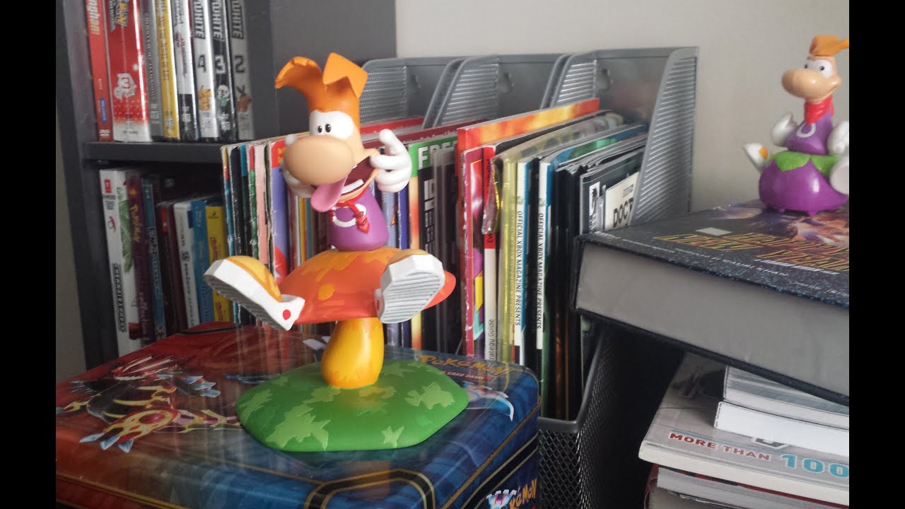
I might have to re-think my characters floating limbs, since if this were a real world toy, tactical placement of the limbs onto the body or a prop would be required (see Rayman), this may limit the available poses and the toy's interactivity.

Rayman figures [source]

Elements Academy Exterior
The design of the Academy's exterior needs to be massively rethought. Rather than designing it to look like a generic serious looking old-style school/academy as seen in the current storyboard, I need to pull from shapes that exist within chemistry & general science - if this were a toy it needs to be eye catching.

Walt Disney Concert Hall, Los Angeles [source]
Chemistry lab equipment [source]

Colours
Each object or character must be limited to a maximum of 4 colours each, keeping in mind that the more colours a real world toy uses, the more expensive it is to paint; as I learnt from McDowell yesterday this is due to each colour requiring an extra coating of paint for it to be achieved.

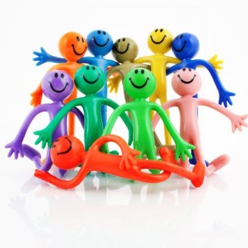
Bendy men [source]

Material
I really like the idea of my characters being textured as if they were made from vinyl. The benefit of this material is that while it still has that important toy aesthetic e.g. smoothness, glossiness, its appearance does not look too childish for an 11-13 year old target audience, such as in the case of highly glossy polypropylene (PP) toys. Active research would of course be required for me to evaluate my claim...

Earl Vinyl Figure [source]
PP plastic Dory figure [source]