Here's my Elements Academy intro storyboard so far. I have rejected thumbnails 3 & 4, meaning the sequence so far runs 1, 2, 5-10. This does not yet represent the full intro, nor are the character designs I have depicted finalised.
 |
| Intro storyboard thumbnails 1-10 |
The hand-drawn storyboard method above does not suit the aesthetic of my pre-established thumbnail process of using vector shapes to build the characters. Below I have experimented with alternative design options...
My particular favourite is Option 03. While it also uses vector shapes, it feels a lot more free than Op 02, and unlike Op 01 it allows for easy experimentation with colours.
Initial Branding Thoughts
In light of yesterday's lecture by Tom McDowell, aspects of my design language will receive somewhat of a reboot in order to develop Elements Academy as if it were a web series designed with its characters and objects able to be easily converted into toys as part of mock-merchandising. |
| A very nicely designed spaceship by Tom McDowell [source] |
Floating Limbs
I might have to re-think my characters floating limbs, since if this were a real world toy, tactical placement of the limbs onto the body or a prop would be required (see Rayman), this may limit the available poses and the toy's interactivity.
 |
| Rayman figures [source] |
Elements Academy Exterior
The design of the Academy's exterior needs to be massively rethought. Rather than designing it to look like a generic serious looking old-style school/academy as seen in the current storyboard, I need to pull from shapes that exist within chemistry & general science - if this were a toy it needs to be eye catching.
 |
| Walt Disney Concert Hall, Los Angeles [source] |
 |
| Chemistry lab equipment [source] |
Colours
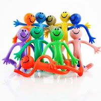
Each object or character must be limited to a maximum of 4 colours each, keeping in mind that the more colours a real world toy uses, the more expensive it is to paint; as I learnt from McDowell yesterday this is due to each colour requiring an extra coating of paint for it to be achieved.
 |
| Bendy men [source] |
Material
I really like the idea of my characters being textured as if they were made from vinyl. The benefit of this material is that while it still has that important toy aesthetic e.g. smoothness, glossiness, its appearance does not look too childish for an 11-13 year old target audience, such as in the case of highly glossy polypropylene (PP) toys. Active research would of course be required for me to evaluate my claim...
 |
| Earl Vinyl Figure [source] |
 |
| PP plastic Dory figure [source] |


Hey Danny, I don't think you need to rethink your floating limbs - at least, let's cross that bridge when Elements Academy gets picked up by a major cartoon network and toy company! :) That said, the '4 colour' logic is great, because it gives you design rules and will actually make your life easier - and yes, the design of the academy itself does need to be thought about, and I like your instincts on this, likewise the 'texturing as vinyl' as another design choice in terms of CGI. I think, looking at your storyboard, you cut to an interior view of the corridor before the elements come bursting out of the doors - or are they bursting into the academy - is it the end of the day or the start of the school day? Anyway, in terms of the style, the storyboard is al about communicating with us, so whatever style combines speediness and responsiveness for you, and clarity of action for the audience.
ReplyDeleteExcellent thank you Phil :) also I think I'll go for end of the school day, I like the idea of the Hydrogen twins bursting out the door after being given detention by Iron (the teacher).
DeleteI agree... the floating limbs should definitely stay! There would be ways to get round the toy issue - I am thinking of the little elasticated push puppets... http://www.notonthehighstreet.com/poshtottydesignsinteriors/product/wooden-push-up-robots
ReplyDeleteHow do the push puppets work? Can you pull the string to extend the distance between the segments?
Delete